
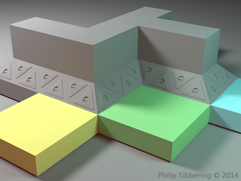
Space Frame lower wall
This is a print of a new design lower wall part (the ones in the foreground) linked to some of the older prints. The new design is a single square with no overlap, and I've also changed the locking prongs to make them a bit stronger. The one on the left is 'Frosted Ultra Detail' (which looks like a really poor print), which the other is cheap 'White Strong and Flexible' sprayed with the usual Plastikote grey primer. I may add the handles to the triangle centre panels.
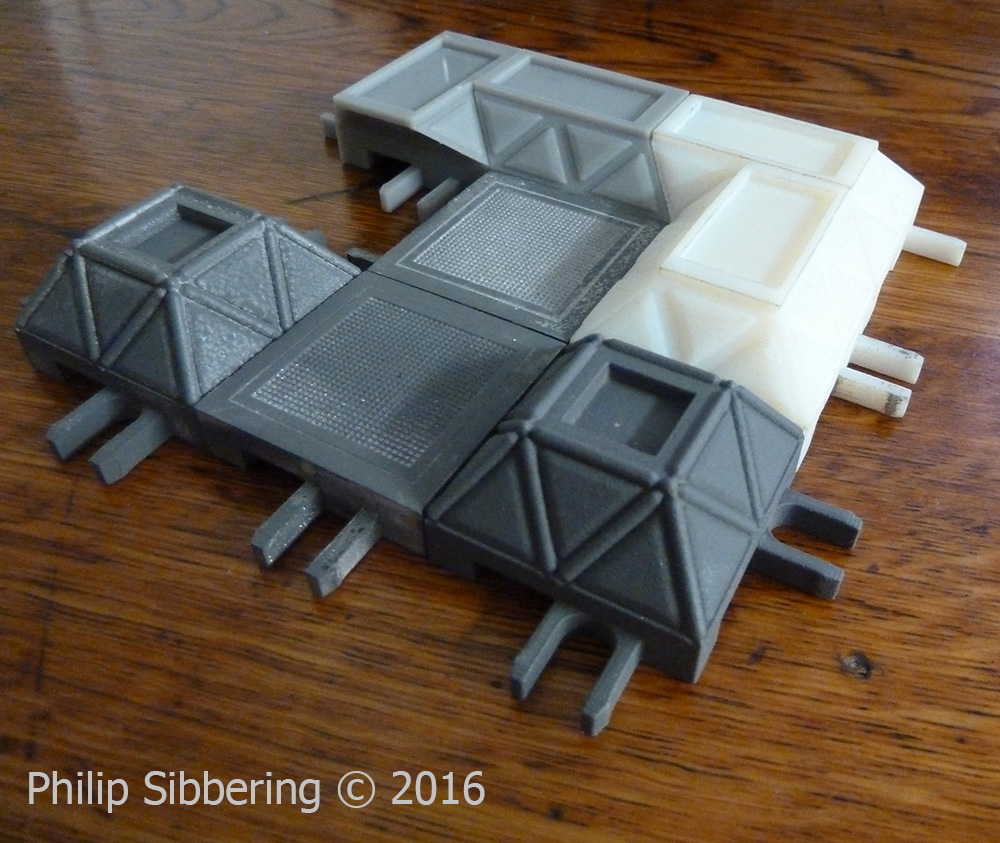
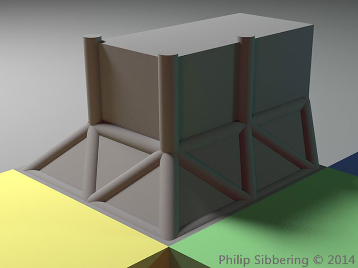
I finally figured out how to put the struts of the space frame in without overlapping the floor area: by sinking the wall section down a bit (doh!). This makes it look like the upper floor panels are resting, or bonded onto, the lower nodes of the space frame. All very simple when you know how. Now all I need is the upper wall sections and a decent 3D printing service.
Raging Heroes Logo
I was on the Raging Heroes website, and I looked at their logo, and I thought: I cannot read that! I had to stare at it for quite a bit to decipher it, especially the end, even though I knew what it was supposed to say. I wondered if it was just me: so I texted my friends with a challenge to tell me what your logo says. Lee had no idea, and his friend thought it said 'Roginshrok' which is close. James noticed that it could be read upside down, which he thought was cool, but he couldn't read it. He made a guess of 'Bagins' - before giving up on the rest. I have a feeling that no one can read it at first blush, unless they know in advance what it is supposed to say, and even then they may struggle as I did.
I talked to <snip>, erm... someone who knows them, and he says that Raging Heroes really like their logo, and they also really like the fact it can be read upside down. That's great but I cannot read it either way and nor can anyone else it seems. It a nice 'puzzle' piece, but missing the point of a logo I think. He said that I should probably leave it. So, knowing that they are sensitive about it, I'm not going apply for the Graphic Artist Job, even though I think they desperately need one, but I couldn't resist coming up with a logo!

Energetic, spiky, metal, with a splash of blood-red. All the elements that suggest a 'raging hero' to me. Nice and easy to read too. Everyone who has seen it; has no problem reading it, and they seem to like it (though they may just be saying that 😛 ). Stefan thinks it has a 'racing vibe'. I also made a Photoshop brush in a basic black and white outline version, that can scale, used as a basis of fancy logos as above;
They could slap this on everything. Unfortunately, it cannot be read upside down (unless you are talented at that sort of thing), but I think if you really wanted a logo that can be read upside down that you should start with a company name that is a rotational ambigram like, er, 'boq'...
Hmm, that might make a good name for a futurist company in Sciror: Pronounced 'Bock'. I already have a logo in mind, and I'm thinking they are evil! (quick googlefu: The Bank of Queensland?)
40mm wall parts (materialise-onsite.com)
I tried a new company for the wall prints called materialise-onsite.com. I chose the PolyJet VeroWhitePlus @ 16µm as I wanted the maximum detail possible so the 45 degree slopped side would be super smooth. In had spoken to the manufacturer of the Polyjet (stratasysdirect.com who also to a print service but a little more expensive), and I was impressed by the sample images they sent me;
This print is 35mm from end to end. The PolyJet can handle details as small as 0.025mm!
So I ordered from materialise-onsite.com with confidence as I knew the quality I would receive. However what turned up was not what I expected, for £91.15, plus another £10 is custom duty, I received these;
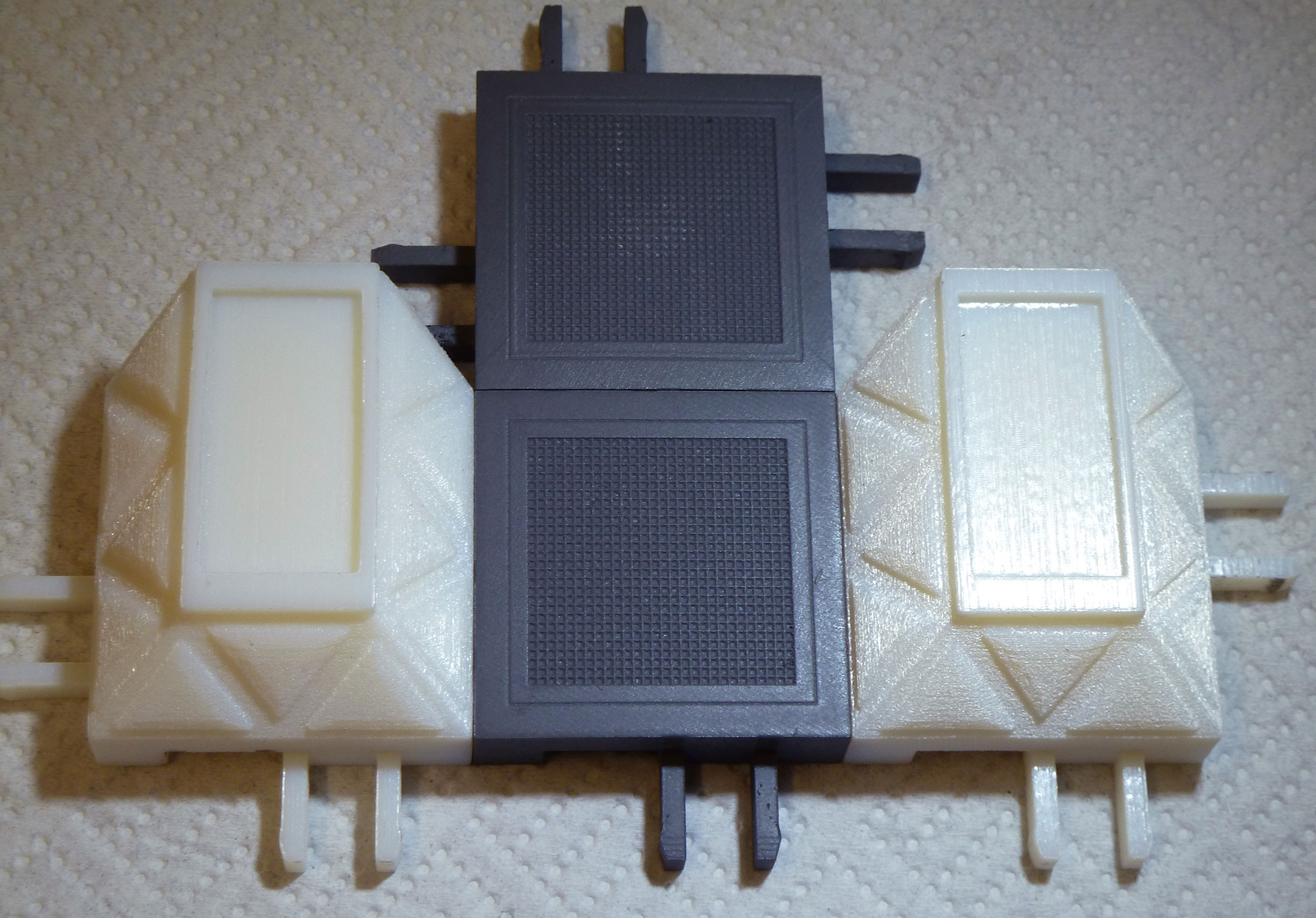
As you can see this is sub-standard and nothing like the picture I was sent. This is as rough as a bag of spanners. I contacted both stratasysdirect.com to ask if this looked like something their printer should put out, and materialise-onsite.com to complain.
Perry, A Senior Project Engineer from stratasysdirect.com got back to me and said this is not printed at 16µm or 32µm. Cheryl, my account manager from materialise-onsite.com asked her CAD/ printer team and they said it was printed at 32µm, and they do not do 16µm! She kindly offered to redo the prints in an alternative method.
We shall see how they turn out.
Looking at the picture, I know that Shapeways Frosted Ultra Detail (the material the floor parts are printed with) are 29µm, and the wall parts look far worse. I would not recommend getting PolyJet VeroWhitePlus prints for miniature masters from materialise-onsite.com as they cannot handle the detail and do not do 16µm regardless of what their website says. Very disappointing and I hope it is not going to be an expensive (£100) mistake.
I'll wait to see what Cheryl comes up with, before I think about trying another manufacturer. I want to give them a chance to put this right. If they can't I may try stratasysdirect.com next, as they make the PolyJet and have confirmed they can do 16µm prints.
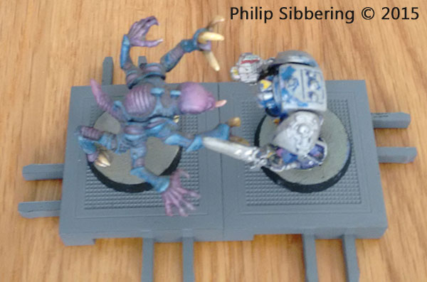
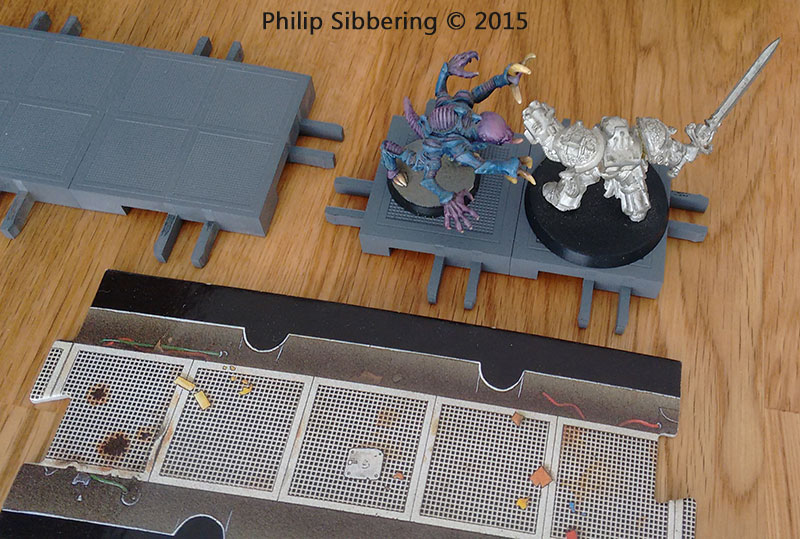
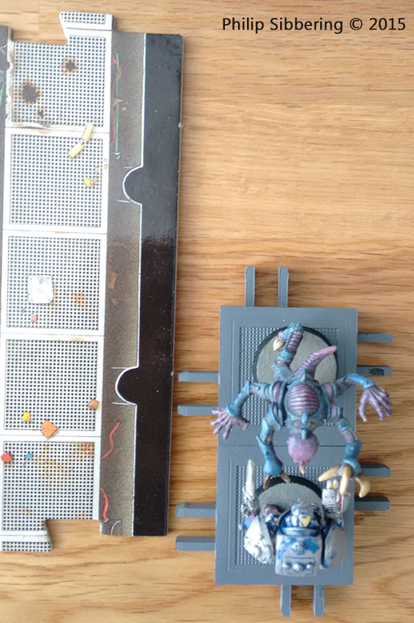
40mm floor part - 3D prints
There are the new 40mm floor parts fresh from Shapeways. Same Frosted Ultra Detail. First impression were good, the grill is a lot more distinct, and the locks are much tighter. There is a slight drop towards some of the corners that I am not happy about. I am looking for a new 3D printer service and I've found a couple that offer the prints via a Polyjet (600x600dpi in x y axis, and 30µm or 16µm layers) which is about 4 to 8 times more detailed than Shapeways Frosted Ultra Detail. Once I've test them out I'll report back.


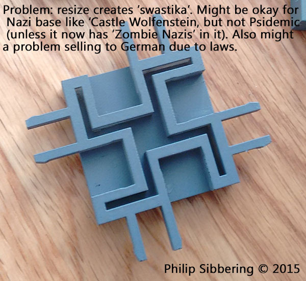
Once I had these new prints I realised that there is what looks like a 'swastika' on the bottom made up of the locks and supports. This is an unintended consequence of reducing the size of the base down to 40mm. I made a note on the image (in case the image was taken out of context and it's got my name on it!) that this may be okay for a game where players are killing Nazi's (like Castle Wolfenstein). A Psidemic could produce this, or even better would be 'Zombie Nazis'! I have a feeling that regardless of post hoc explanation it may be offensive and therefore a problem. Also Germany has strict laws against the swastika so selling there may be an issue. To make it very clear, the swastika was not intended, the design is based on the larger 50mm which does not look like a swastika. It is merely an unfortunate, and unintended, side effect of reducing the floor part.
I may have to mess around with the design a little to get rid of the 'swastika'.
50mm to 40mm rescale
Now that I've had the 50mm 3D print of the 50mm floor part for a few days in my hand, and seeing how miniatures look on them, I'm now wondering if 40mm really might be a better size for the floor tile after all? 40mm will still take 25-40mm bases, and look less bare with the smaller based models than 50mm. It's true 2 x 25mm based models can stand side by side on the 50mm tile, but many miniature manufactures now use 32mm bases and they do not fit neatly side by side onto a 50mm base so that justification is gone. Considering the future trend of base sizes are probably going to increase (they started out at 20mm!), the part has to look good with 40mm and 32mm bases.
In regards to 'Space Hulk' I think the 40mm tile with sloped walls could accommodate the awkward genestealers with their wide arms (around 50mm across) despite their small 25mm base. I think I can thin out the wall top to around 20mm to get 40mm (floor) + 10mm (slope indent) + 10mm (slope indent) to get a total of 60mm from inside wall top to opposite inside wall top. Maybe even thin the top wall down a bit more, to around 15mm to improve that distance to around 65mm.
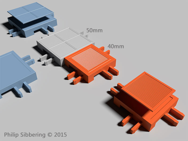
While rescaling I made a couple of refinements to the part: the grill is a little more chunky on the 40mm, to test it out and see what it feels like once printed. Also tweaked the connectors to see if I can tighten them up a bit.
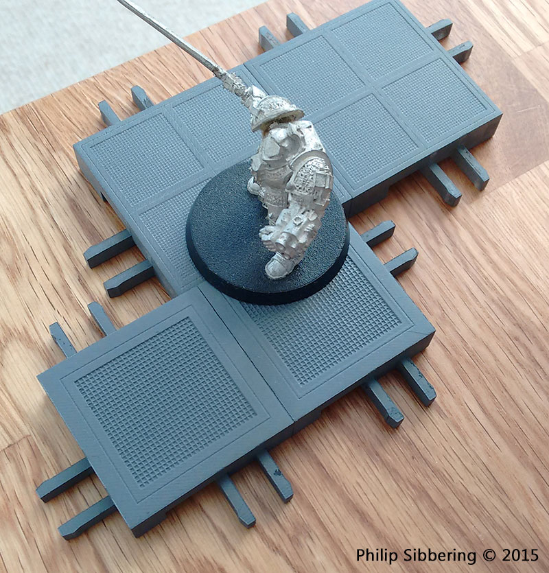
50mm floor part - 3D prints
The 3D prints arrived from Shapeways. Frosted Ultra Detail, with a light spray of Grey Plasti-kote. At 50mm there is plenty of clearance for a Grey Knight mounted on a 40mm base.
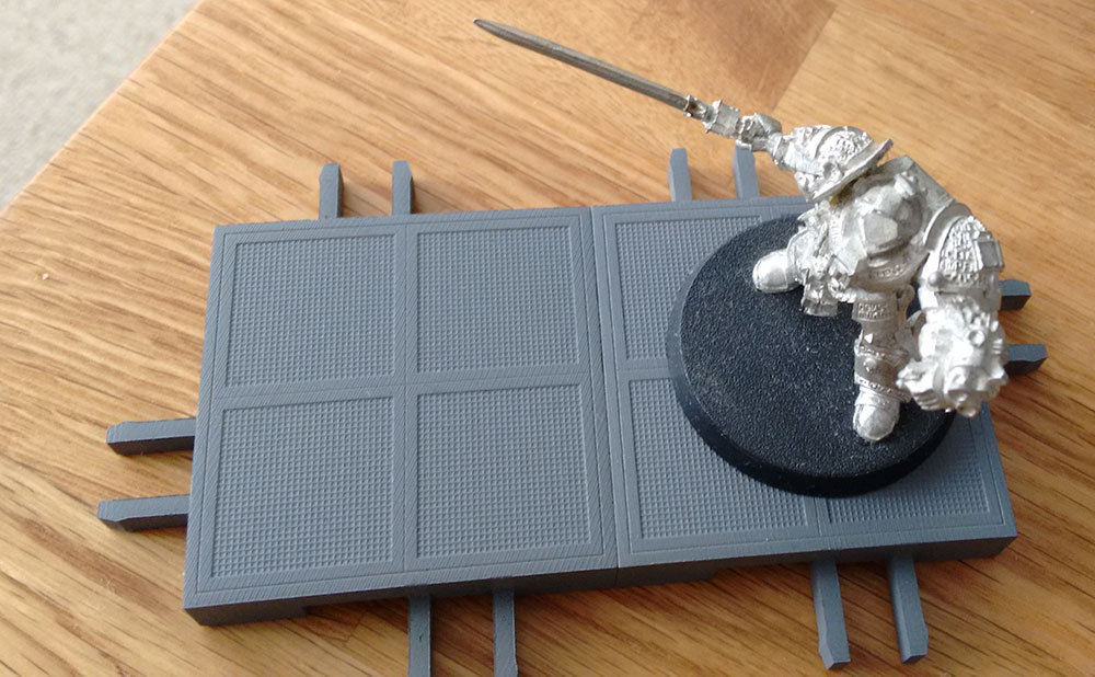
The grill mesh is perhaps a little too fine for Shapeways to handle 100% but the overall effect is not too bad. There are striations on the upper flat surface (the border around the grills) but nothing a light sanding couldn't take of. The prongs on the locking mechanism feel pretty strong with a light squeeze, and they seem to be a close fit and grip well when being pushed in, but once fully together the locking lugs are a bit loose (about a 1mm of play). In a future print I'll tighten that up a bit in the design.
50mm floor part - render
These are the new 50mm floor part for the sloped wall tile set. The playing surface is made up of 4 x 25mm grills, to allow two 25mm based miniatures to stand side by side. The locking tabs are like those plastic side release buckles. Once connected the floor parts should be pretty stable during gaming.
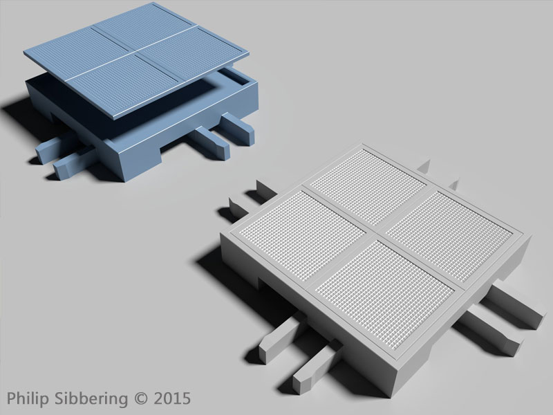
The concern is the prongs on the locking mechanism. I'm going to print these up via Shapeways to see if they are flexible and strong enough. I know Trollcast is very different from the Acrylic of Frosted Ultra Detail but it should give me and idea.
Windows/ Linux GUI
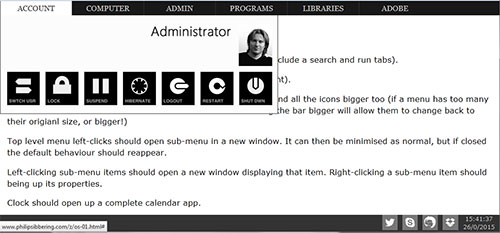
As a windows user these are my thoughts on the GUI, and the up and coming windows 9, erm, 10. Currently I use windows 7, though this is more due to a lack of compelling reason to upgrade. I do no mind windows 8 or 8.1 once the start menu is added back in, and if I was buying a new PC I would use it, thought the interface is not perfect. There seems to be a drive to change the GUI for windows. I suppose this is because windows 7's GUI would be a little fiddly for smaller devices (which are very popular) and it's getting a little old. I think Microsoft wants a new way of doing this, fresh and bright. So they came up with windows 8 which is really nothing more than exploding the start menu all over the screen to make the icons big enough for fingers on small screens.
Soon windows 10 will be out, and I hope they add the start menu back, but if they really want to change it up I think there is a rich resource they can mine for the layout of the GUI: wed pages.
Let me explain. OS and their GUI develop very slowing compared to the massive turnover or website design. All websites need to be easy and quick to navigate else businesses lose money. It's kind like evolution for the internet, certain characteristics of design win out and prove popular. Most websites now have good navigation, with clear, top of the page, categories with drop down menus. I think this would make a good basis of a GUI for an OS as it is proven to be quick and seeing as everyone is used to seeing it: intuitive and second nature. They also collapse down to lists for use on mobile phones. Kills two birds with one stone, and no changes needed to the GUI for either.
I put together a rough concept of what I am talking about here: 'mofo os'
Seems simple enough.
I would also like Ubuntu (my fav Linux distro) or an Ubuntu derivative use this. I think the unity interface wastes space and is a bit awkward.
Read the rest of this entry »Sloped wall tiles
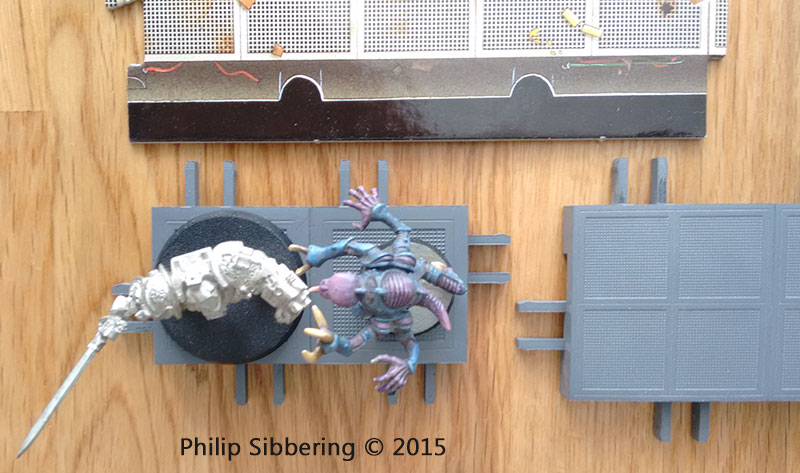
This is a new design of wall tiles with sloped sides. The idea is to keep the floor part a reasonable size (take bases of size 50-30mm) yet allow miniatures will limbs and weapons that extend beyond their base to be used. As mentioned in one of my previous posts the Genestealers from Space Hulk are mounted on a 25mm base (original 1E set) yet their arms are about 50mm across. A Grey Knight has a 40mm base (as do all the new Terminators) and the sword and storm bolter arms extend beyond the bound of the base. I could do a 60mm floor part which would give enough clearance but I think that is getting too large, so I came up with this design;

This design with a 50mm floor part would give a total distance between the top parts of the wall of around 50mm (floor) + 12.5mm (slope) +12.5mm (slope) = 75mm which is more than enough clearance for a Genestealer or Grey Knight. Interestingly at 40mm we get 60mm from wall top to wall top, which is also plenty. I think I'll start with the 50mm and take it from there.
Shapeways problem
My new walls for my prototype modular floor tiles turn up today and I'm not happy. There are some very serious distortion in the prints, and they both seems to have a lace like pattern inside. I've contacted Shapeways about this, and they have asked for photos and are investigating. I know Shapeways doesn't have the highest detail, and they are 'cheap' for what they are, but I at least expect my prints to be straight if they cost 100 euros!
Read the rest of this entry »