
COR housing
Following on from my earlier post 'Future Perfect', I want to start to layout the argument for my vision. Construction Over Road/ Rail Housing make use of the wasted space above roads and rail systems. The idea is to better manage space in countries will high population densities, with an aim to maximize 'nature space'.
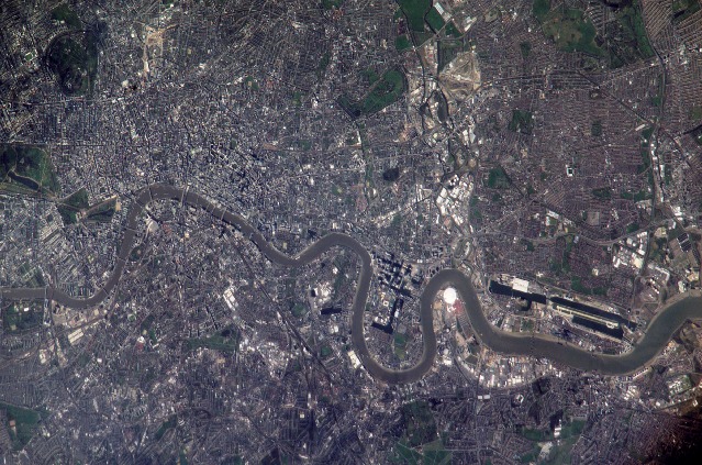
Nature space is any outside space that has direct access to the sun. This is perfect for plants, and studies show that humans enjoy nature far more than concrete jungles. Modern city design eats into this nature space and removes nature space from people's lives. If you take a satellite image of central London all you'll see is roads, pavements, and barren roof tops. We need roads but they're hardly human friendly once you step out of a car. Most roofs a not used by humans at all, and devoid of life. Pavements are also needed but not much of a joy more utility. But if you do not have a car: it seems most would prefer to walk/ cycle through a park (away from the fumes, noise, and traffic chaos).
The problems with modern city design are endless. As London develops the limitations of traditional architecture start to show. The more skyscrapers you put in: the more you'll overload the road system. Even cities like New York, with very wide roads, have ground to a virtual halt. This is due to the amount of traffic needed to get people and goods to all those skyscrapers on a daily basis!
There has to be a new way to look at city planning, or more specifically housing. In the ye old days it made sense to build a house by the side of muddy track. There was plenty of nature, transport was by foot, horseback or carriage (pulled by horses), and humans had plenty of fresh air. Even in the early city: the industrialists built terraced houses beside narrow roads that saw little traffic. Children could play outside and were rarely interrupted by horse or cart. All that is gone.
Read the rest of this entry »Updating 1,000 chapter project
It's been a long time since I last looked at the 1,000 chapter project thread over on Bolter and Chainsword, and the last official update was back in 2012! Has it really been that long? I guess it has. So I had a read through the last part of the thread and collected all the updates, basically 5 new chapters (Dancing Scythes, Ghosts of Retribution, Helios Guard, Praetorians, and the Thunderbolts), and a few updated images (Black Guard, Libators, Patriarchs of Ulixis, and the Emperor's Shadows).
It was a lot of fun updating this, and reading about some interesting chapters!
Here is a link to the updated project: 1,000 Chapters
Mega York 1
I've added an image below of 'Mega York 1' to the Ecopolis page. The idea is to get across the sheer scale of a 300m x 300m cube if built in a modern city like New York. They are massive, like the Mega-Blocks of Judge Dredd only bigger. The main difference is population density: a mega-block in 2,000AD can house 75,000 citizens while an Ecorium can house a mere 2,160. This does not take into account infrastructure to support the block, and where the 2,000AD mega block needs supply lines for food etc. the Ecorium is basically a massive farm and relatively self-sufficient.
Earth in 40K is covered with these buildings, along with double, and triple, stacking the population of Terra would be in the trillions. The tops of the Ecorium create a new planetary surface onto which all the gothic architecture is built, the upper surface is for the pilgrims and worship of the Ghod Emperor.
Space Frame lower wall
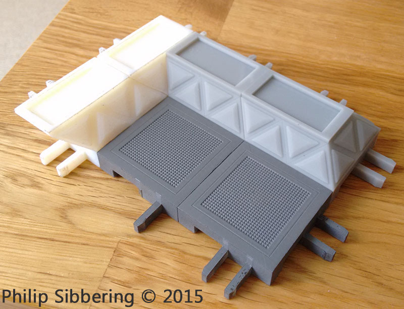
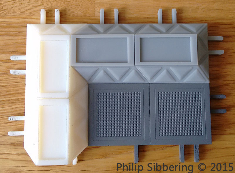
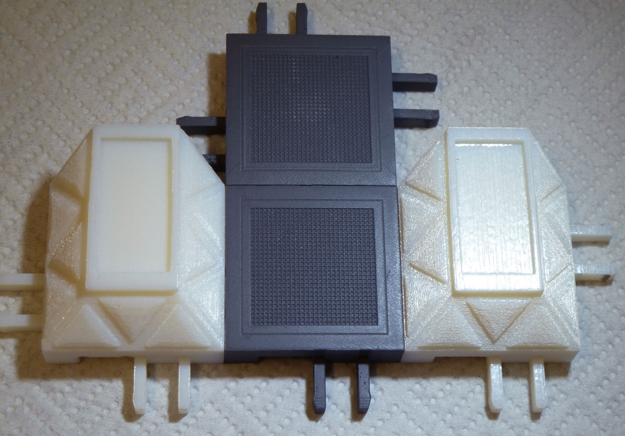
This is a print of a new design lower wall part (the ones in the foreground) linked to some of the older prints. The new design is a single square with no overlap, and I've also changed the locking prongs to make them a bit stronger. The one on the left is 'Frosted Ultra Detail' (which looks like a really poor print), which the other is cheap 'White Strong and Flexible' sprayed with the usual Plastikote grey primer. I may add the handles to the triangle centre panels.
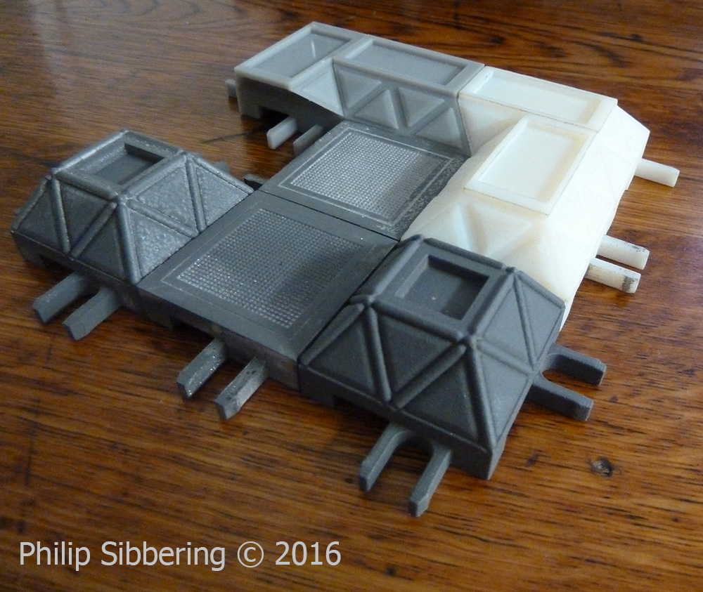
I finally figured out how to put the struts of the space frame in without overlapping the floor area: by sinking the wall section down a bit (doh!). This makes it look like the upper floor panels are resting, or bonded onto, the lower nodes of the space frame. All very simple when you know how. Now all I need is the upper wall sections and a decent 3D printing service.
Raging Heroes Logo
I was on the Raging Heroes website, and I looked at their logo, and I thought: I cannot read that! I had to stare at it for quite a bit to decipher it, especially the end, even though I knew what it was supposed to say. I wondered if it was just me: so I texted my friends with a challenge to tell me what your logo says. Lee had no idea, and his friend thought it said 'Roginshrok' which is close. James noticed that it could be read upside down, which he thought was cool, but he couldn't read it. He made a guess of 'Bagins' - before giving up on the rest. I have a feeling that no one can read it at first blush, unless they know in advance what it is supposed to say, and even then they may struggle as I did.
I talked to <snip>, erm... someone who knows them, and he says that Raging Heroes really like their logo, and they also really like the fact it can be read upside down. That's great but I cannot read it either way and nor can anyone else it seems. It a nice 'puzzle' piece, but missing the point of a logo I think. He said that I should probably leave it. So, knowing that they are sensitive about it, I'm not going apply for the Graphic Artist Job, even though I think they desperately need one, but I couldn't resist coming up with a logo!

Energetic, spiky, metal, with a splash of blood-red. All the elements that suggest a 'raging hero' to me. Nice and easy to read too. Everyone who has seen it; has no problem reading it, and they seem to like it (though they may just be saying that 😛 ). Stefan thinks it has a 'racing vibe'. I also made a Photoshop brush in a basic black and white outline version, that can scale, used as a basis of fancy logos as above;

They could slap this on everything. Unfortunately, it cannot be read upside down (unless you are talented at that sort of thing), but I think if you really wanted a logo that can be read upside down that you should start with a company name that is a rotational ambigram like, er, 'boq'...
Hmm, that might make a good name for a futurist company in Sciror: Pronounced 'Bock'. I already have a logo in mind, and I'm thinking they are evil! (quick googlefu: The Bank of Queensland?)
Future Perfect
So I'm pushing forward with the Sciror stuff, and deep thinking about the future of civilization (always fun) and its impact on the world. While Ecorium designs make a lot of sense (to me), and it's true I could simply leave it at that and say 'the machines did it', I thought it would be more fun to imagine some evolutionary pre-steps invented by humans to reinforce the idea that the machines gave us what we wanted. In rethinking architecture I need new some tools to explain how it all works, to communicate to the masses why this is a good idea. I came up with 'Blocks Space Diagrams' ;

You can read more about it here: Block Space Diagrams
This then leads to idea about how to design future building by giving a clear idea of our design goals. To really change the collective vision of what a future city will really looks like. This lead to me playing about in Blender to create the basics;
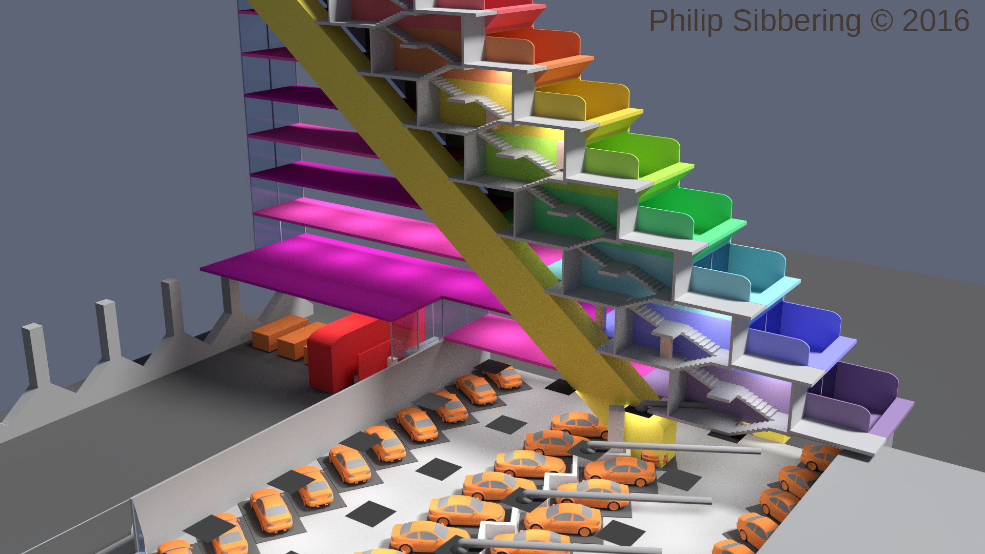
This is a cut away of one half of the design, a slice through the structure. It shows the staggered stacking of the units (like an Aztec pyramid!), the 'hill lift' to account for the slope, and the layout of the car park and roads. All very compact and build around a steel frame with fireproof pre-fab panels. Each hab-unit is sound isolated from the steel structure and neighbours. Each hab-unit has its own walled garden where privacy is paramount (hence the high walls and end of garden overhang (stops people above looking into a downstairs neighbours garden)). Security is build into the design. A very safe environment. The slice above also shows the emergency stair system, build on top of the hill lift, and implemented every 10 units across.
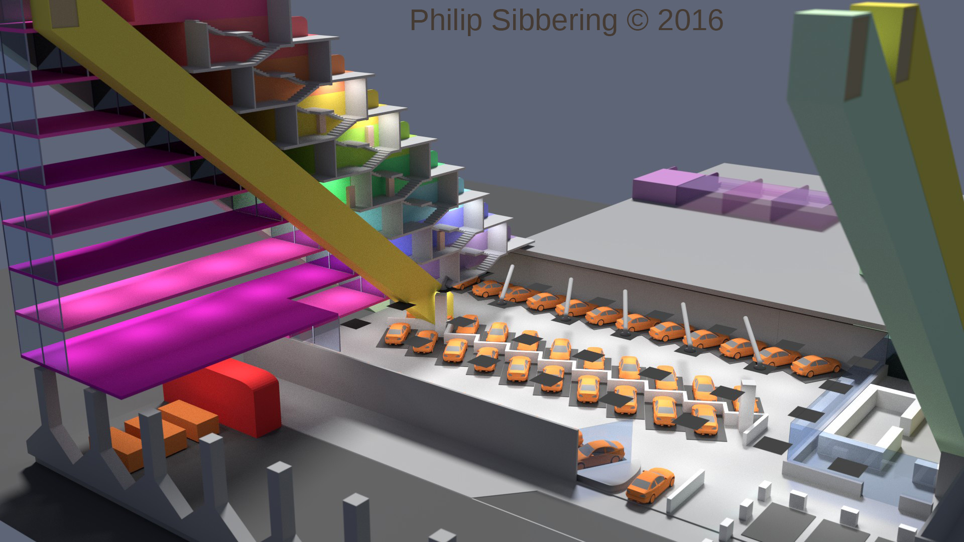
The purple space is 'commercial' as is where we can put shops (who like to control the light to best display product), the early version of rack farms to grow food within the city, or data-centres where the heat can be recovered and pumped into the hab-units in winter, or power air-conditioning in the summer. The space in the back, the large grey area covers more car park, but on top would be a garden part exclusive to the residents (more security).
The problem with sky scrapers, and building up people density that way, is supplying them - infrastructure has to increase dramatically and often road and rail systems will be overwhelmed as more and more sky scrapers are built. New York has very wide roads (compared to London) but it's grid locked. London couldn't have sky scrapers in the numbers like that have in New York else the road and rail system would fail. When we did build a group of sky scrapers in London we had to build the Docklands light railway system so people could get to Canary Wharf.
With my design we can population density without over stressing the populace because it's making use of the wasted area above the road space, and also adds a ton of secure off-road parking. This design is perfect for large roads leading into cities, or around cities like the M25. I would cover all 188km of the M25 (modern steel beams can easily span a motorway). With each 18 block slice being 6.5m wide, that's 507,600 units. Later they can be extended into the cities with redevelopments. When I walk around London I see a ton of unused space above the roads. A wasted opportunity. Further, we can also convert some of the commercial space (shown above) into light road ways for cycles and electric vehicles. We could have double or triple-decker roads, perhaps with rail and underground systems beneath, which eventually leads to the stacked rail system of the Ecorium. We could also use the blocks to route electricity, and fibre optics.
40mm wall parts - redo
These are the replacement prints I received from materialise-onsite.com printed up on "SLU machines (high-definition, they build at the same resolution as a Vipr machine) in the grey Xtreme material" which sounds impressive. They are far better than the first lot of PolyJet prints they sent out, but these new ones are a bit of a mixed bag.

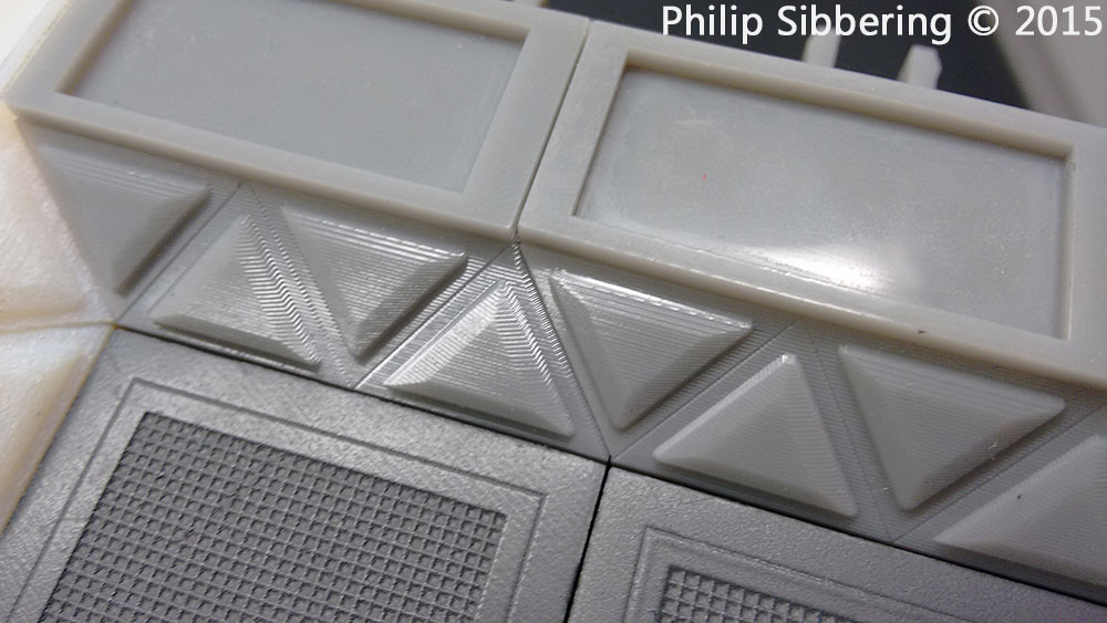

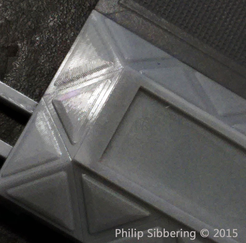
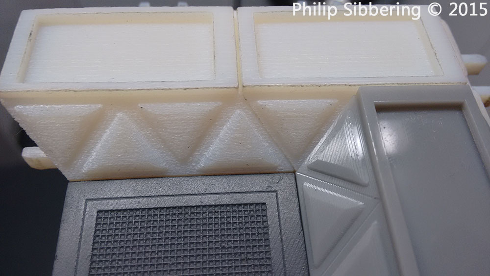
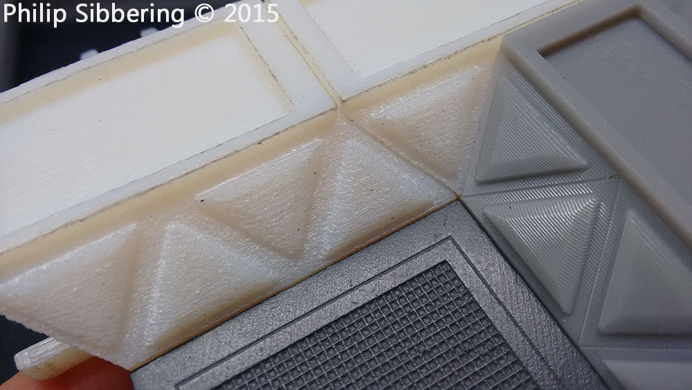
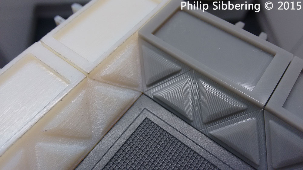
The new prints are far crisper, with the square edges, very and smooth flat horizontal, and vertical surfaces - being almost perfect. Unfortunately the sloped sides are stepped, and while the steps are clean and precise, they are still steps. In the last 5 images you can clearly see what I am talking about, and at 28mm scale this is far too obvious (the mould, and final cast, will duplicated this stepping). This stepping would really show up if the wall parts were painted and then dry brushed. Also in the last 3 you can see how bad the white printed parts really are.
If I have a project without any slopes or curves it may be an ideal process and I will bear this process in mind should that come about (I might use it for future 'base frames' which are basically the floor part without the grill, so all flat sides and no slopes. I'd physically sand the edges to get the bevel rather than print it up).
I have asked materialise-onsite.com if I can have a refund if they cannot do 16µm - that is what was on their website, and that is what I want.
40mm wall parts (materialise-onsite.com)
I tried a new company for the wall prints called materialise-onsite.com. I chose the PolyJet VeroWhitePlus @ 16µm as I wanted the maximum detail possible so the 45 degree slopped side would be super smooth. In had spoken to the manufacturer of the Polyjet (stratasysdirect.com who also to a print service but a little more expensive), and I was impressed by the sample images they sent me;

This print is 35mm from end to end. The PolyJet can handle details as small as 0.025mm!
So I ordered from materialise-onsite.com with confidence as I knew the quality I would receive. However what turned up was not what I expected, for £91.15, plus another £10 is custom duty, I received these;
As you can see this is sub-standard and nothing like the picture I was sent. This is as rough as a bag of spanners. I contacted both stratasysdirect.com to ask if this looked like something their printer should put out, and materialise-onsite.com to complain.
Perry, A Senior Project Engineer from stratasysdirect.com got back to me and said this is not printed at 16µm or 32µm. Cheryl, my account manager from materialise-onsite.com asked her CAD/ printer team and they said it was printed at 32µm, and they do not do 16µm! She kindly offered to redo the prints in an alternative method.
We shall see how they turn out.
Looking at the picture, I know that Shapeways Frosted Ultra Detail (the material the floor parts are printed with) are 29µm, and the wall parts look far worse. I would not recommend getting PolyJet VeroWhitePlus prints for miniature masters from materialise-onsite.com as they cannot handle the detail and do not do 16µm regardless of what their website says. Very disappointing and I hope it is not going to be an expensive (£100) mistake.
I'll wait to see what Cheryl comes up with, before I think about trying another manufacturer. I want to give them a chance to put this right. If they can't I may try stratasysdirect.com next, as they make the PolyJet and have confirmed they can do 16µm prints.
40mm floor part - 3D prints
There are the new 40mm floor parts fresh from Shapeways. Same Frosted Ultra Detail. First impression were good, the grill is a lot more distinct, and the locks are much tighter. There is a slight drop towards some of the corners that I am not happy about. I am looking for a new 3D printer service and I've found a couple that offer the prints via a Polyjet (600x600dpi in x y axis, and 30µm or 16µm layers) which is about 4 to 8 times more detailed than Shapeways Frosted Ultra Detail. Once I've test them out I'll report back.


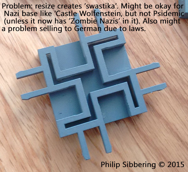
Once I had these new prints I realised that there is what looks like a 'swastika' on the bottom made up of the locks and supports. This is an unintended consequence of reducing the size of the base down to 40mm. I made a note on the image (in case the image was taken out of context and it's got my name on it!) that this may be okay for a game where players are killing Nazi's (like Castle Wolfenstein). A Psidemic could produce this, or even better would be 'Zombie Nazis'! I have a feeling that regardless of post hoc explanation it may be offensive and therefore a problem. Also Germany has strict laws against the swastika so selling there may be an issue. To make it very clear, the swastika was not intended, the design is based on the larger 50mm which does not look like a swastika. It is merely an unfortunate, and unintended, side effect of reducing the floor part.
I may have to mess around with the design a little to get rid of the 'swastika'.
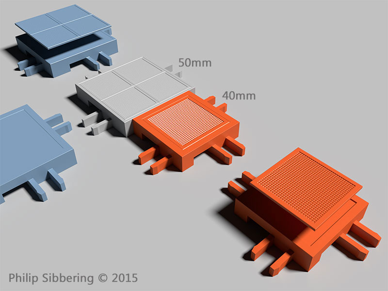
50mm to 40mm rescale
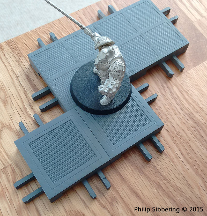
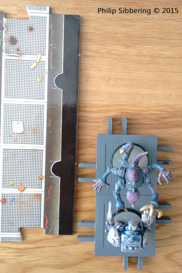
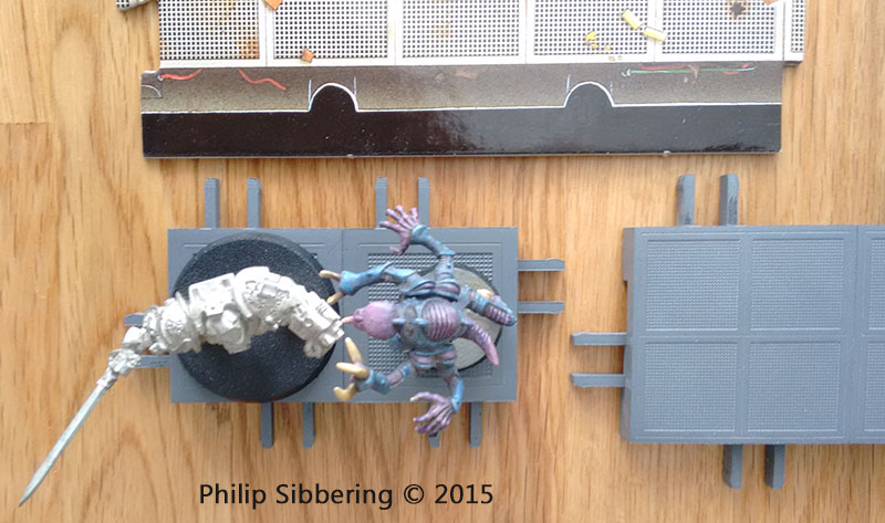
Now that I've had the 50mm 3D print of the 50mm floor part for a few days in my hand, and seeing how miniatures look on them, I'm now wondering if 40mm really might be a better size for the floor tile after all? 40mm will still take 25-40mm bases, and look less bare with the smaller based models than 50mm. It's true 2 x 25mm based models can stand side by side on the 50mm tile, but many miniature manufactures now use 32mm bases and they do not fit neatly side by side onto a 50mm base so that justification is gone. Considering the future trend of base sizes are probably going to increase (they started out at 20mm!), the part has to look good with 40mm and 32mm bases.
In regards to 'Space Hulk' I think the 40mm tile with sloped walls could accommodate the awkward genestealers with their wide arms (around 50mm across) despite their small 25mm base. I think I can thin out the wall top to around 20mm to get 40mm (floor) + 10mm (slope indent) + 10mm (slope indent) to get a total of 60mm from inside wall top to opposite inside wall top. Maybe even thin the top wall down a bit more, to around 15mm to improve that distance to around 65mm.
While rescaling I made a couple of refinements to the part: the grill is a little more chunky on the 40mm, to test it out and see what it feels like once printed. Also tweaked the connectors to see if I can tighten them up a bit.