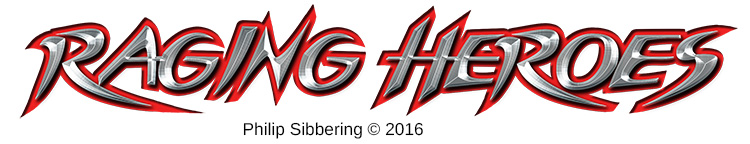
Raging Heroes Logo
I was on the Raging Heroes website, and I looked at their logo, and I thought: I cannot read that! I had to stare at it for quite a bit to decipher it, especially the end, even though I knew what it was supposed to say. I wondered if it was just me: so I texted my friends with a challenge to tell me what your logo says. Lee had no idea, and his friend thought it said 'Roginshrok' which is close. James noticed that it could be read upside down, which he thought was cool, but he couldn't read it. He made a guess of 'Bagins' - before giving up on the rest. I have a feeling that no one can read it at first blush, unless they know in advance what it is supposed to say, and even then they may struggle as I did.
I talked to <snip>, erm... someone who knows them, and he says that Raging Heroes really like their logo, and they also really like the fact it can be read upside down. That's great but I cannot read it either way and nor can anyone else it seems. It a nice 'puzzle' piece, but missing the point of a logo I think. He said that I should probably leave it. So, knowing that they are sensitive about it, I'm not going apply for the Graphic Artist Job, even though I think they desperately need one, but I couldn't resist coming up with a logo!
Energetic, spiky, metal, with a splash of blood-red. All the elements that suggest a 'raging hero' to me. Nice and easy to read too. Everyone who has seen it; has no problem reading it, and they seem to like it (though they may just be saying that 😛 ). Stefan thinks it has a 'racing vibe'. I also made a Photoshop brush in a basic black and white outline version, that can scale, used as a basis of fancy logos as above;
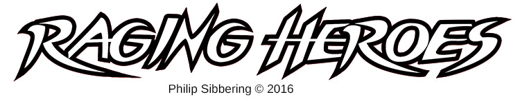
They could slap this on everything. Unfortunately, it cannot be read upside down (unless you are talented at that sort of thing), but I think if you really wanted a logo that can be read upside down that you should start with a company name that is a rotational ambigram like, er, 'boq'...
Hmm, that might make a good name for a futurist company in Sciror: Pronounced 'Bock'. I already have a logo in mind, and I'm thinking they are evil! (quick googlefu: The Bank of Queensland?)
Subscribe | Patronise | Contact
Comment
Hearing feedback is very important to me in developing my ideas. Much of my designs are inspired, and crafted, by chatting to fans on forums before snowballing into a full concepts posted on this website. I would like to thank all those who have contributed critiques and participated in discussions over the years. If you would like join in, you are most welcome!
To support my work: Connect